Extra Sud — Terrone Drop
The Concept
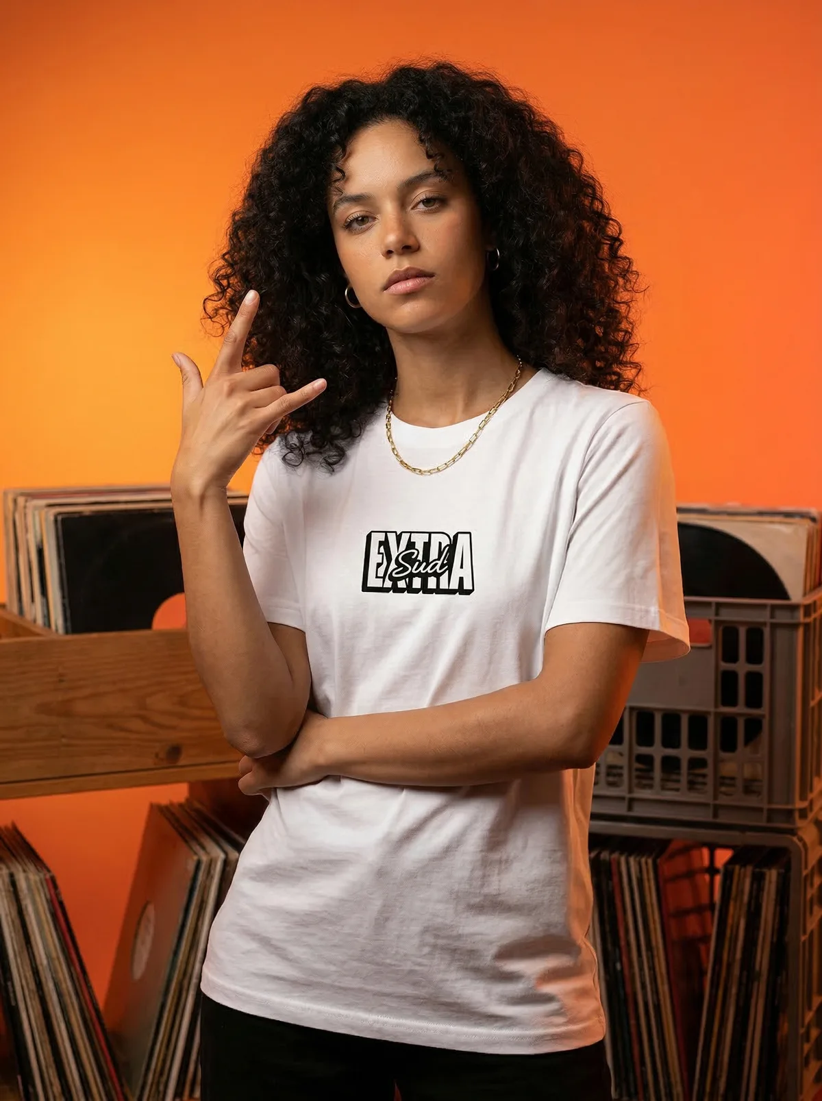
An AI streetwear shoot for Siculamente's Extra Sud collection: two graphic tees against a burnt-orange backdrop. It's the launch campaign for the drop, and the same props recur across all four frames: plastic and wood record crates, full of vinyl, with a turntable visible in the back shots. That's where the Southern rap reference sits, in the props on set. Each tee is shot twice, front and back: a box logo on the chest, EXTRA in block caps with Sud in script over it inside the same frame, and down the back a repeating TERRONE print that loses its fill line by line until only the outline is left. The print changes colour with the tee: black on the white one, red on the black. Two AI models wear them, working poses lifted from rap portraiture — a hand thrown at the lens, fingers cocked; both hands up, pointed back at the print; arms raised, hands in the hair.
Applications
The back print is what the customer wants to see in full on a graphic tee. This one runs the length of the back and fades out at the hem, so a square catalogue crop clips the tail. The vertical keeps it whole and is the master to crop down from where a channel forces square. The subject sits close to the top edge in every frame, so for Stories the gradient extends cleanly upward and a headline goes in there. Cut out against marketplace white, the pale tee needs the orange cast pulled out of it first, plus a keyline to separate it from the page; the black one holds. The back shots, crates and turntable in frame, open the lookbook and work as the landing-page hero.
Technical Workflow
Gallery
Interested in a custom-made project for your brand?
Book Demo